
[1] "Tidyverse is ready to use" [1] "carat" "cut" "color" "clarity" "depth" "table" "price"
[8] "x" "y" "z" Mastering dplyr for Data Wrangling
Today’s Mission: Data Wrangling
Transform messy data into insights!
diamonds with dplyr & ggplot2dplyr VerbsWhat is dplyr? 🛠️
dplyr provides a fast, consistent grammar of data manipulation with intuitive verbs:
filter() — Pick rows matching specific conditionsselect() — Pick and rename specific columnsmutate() — Add new variables or transform existing onesarrange() — Reorder rows based on column valuessummarise() & group_by() — Calculate grouped summary statisticsTip
We combine these verbs sequentially using the pipe operator (%>% or |>) to build clean data workflows!
Note
The diamonds dataset contains information about ~54,000 diamonds, including the following.
tidyverse LibraryTip
Code to install and load the tidyverse package, which includes dplyr and ggplot2, and to display the column names of the diamonds dataset.
[1] "Tidyverse is ready to use" [1] "carat" "cut" "color" "clarity" "depth" "table" "price"
[8] "x" "y" "z" diamonds Data (Part 1)Use filter() to select diamonds with Ideal or Premium cut and carat between 0.7 and 2.5.
Use mutate() to convert USD prices to UK Pounds (£ GBP, ~0.79 exchange rate) and calculate price per carat.
diamonds Data (Part 2)Use select() to choose specific columns from the transformed data.
Use arrange() to sort the transformed data.
library(tidyverse)
# Filter the data according to cut and carat size
uk_diamonds <- diamonds %>%
  filter(cut %in% c("Ideal", "Premium"),
         carat >= 0.7 & carat <= 2.5)
# Mutate to convert USD prices to UK Pounds
# (£ GBP, ~0.79 exchange rate) and
# calculate price per carat
uk_diamonds_mutate <- uk_diamonds %>%mutate(
    price_gbp = round(price * 0.79, 2),
    price_per_carat_gbp = round(price_gbp / carat, 2))
# Select specific columns from the transformed data
uk_diamonds_mutate_select <-
  uk_diamonds_mutate %>%
    select(carat,
          cut,
          color,
          clarity,
          price_usd =
            price,
            price_gbp,
            price_per_carat_gbp)
# Arrange the data frame in descending order of price in GBP
uk_diamonds_mutate_select_arrange <-
 uk_diamonds_mutate_select %>%
  arrange(desc(price_gbp))
# View the final transformed data frame
View(uk_diamonds_mutate_select_arrange) Try copying and pasting the above code into your RStudio console to see the results for yourself!
Let’s convert USD prices to UK Pounds (£ GBP, ~0.79 exchange rate) and inspect top diamonds:
library(tidyverse)

# Pipeline: filter -> mutate -> select -> arrange
uk_diamonds <- diamonds %>%

  # 1. filter: Select diamonds with
  # Ideal or Premium cut and 0.7 to 2.5 carats
  filter(cut %in% c("Ideal", "Premium"),
    carat >= 0.7 & carat <= 2.5) %>%

  # 2. mutate: Convert USD price to UK
  # Pounds (£) & calculate price per carat
  mutate(
    price_gbp = round(price * 0.79, 2),
    price_per_carat_gbp = round(price_gbp / carat, 2)
  ) %>%

  # 3. select: Keep only relevant columns
  # with descriptive names
  select(carat,
         cut,
         color,
         clarity,
         price_usd = price,
         price_gbp,
         price_per_carat_gbp) %>%

  # 4. arrange: Sort in descending
  # order of price in GBP
  arrange(desc(price_gbp))

# Preview the transformed data frame
head(uk_diamonds, 5)Preview the transformed data frame
# A tibble: 5 × 7
  carat cut     color clarity price_usd price_gbp price_per_carat_gbp
  <dbl> <ord>   <ord> <ord>       <int>     <dbl>               <dbl>
1  2.29 Premium I     VS2         18823    14870.               6494.
2  1.51 Ideal   G     IF          18806    14857.               9839.
3  2.07 Ideal   G     SI2         18804    14855.               7176.
4  2.29 Premium I     SI1         18797    14850.               6485.
5 2.04 Premium H SI1 18795 14848. 7278.dplyrWe can also group by categories such as cut to compare summary statistics in UK currency:
# Calculate average and median prices in UK Pounds across diamond cuts
diamond_summary <- diamonds %>%
  mutate(price_gbp = price * 0.79) %>%
  group_by(cut) %>%
  summarise(
    count = n(),
    avg_carat = round(mean(carat), 2),
    avg_price_gbp = round(mean(price_gbp), 2),
    median_price_gbp = round(median(price_gbp), 2)
  ) %>%
  arrange(desc(avg_price_gbp))

print(diamond_summary)ggplot2Now let’s visualize the relationship between diamond carat size, cut, and price in UK Pounds (£):
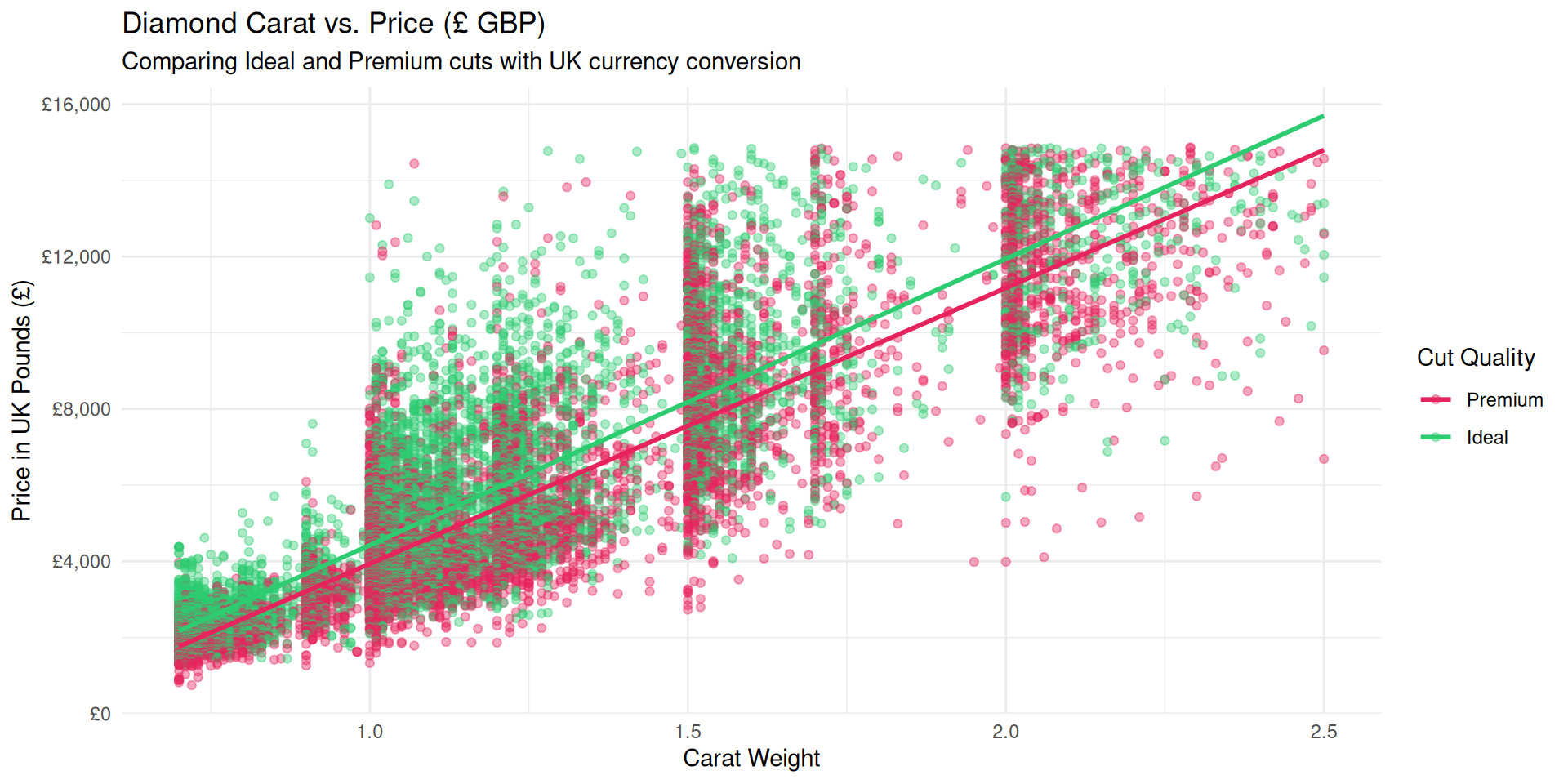
# Scatter plot with trend lines comparing Ideal and Premium cuts
ggplot(uk_diamonds, aes(x = carat, y = price_gbp, color = cut)) +
  geom_point(alpha = 0.4, size = 1.5) +
  geom_smooth(method = "lm", se = FALSE, linewidth = 1) +
  scale_y_continuous(labels = scales::dollar_format(prefix = "£")) +
  scale_color_manual(values = c("Ideal" = "#2ECC71", "Premium" = "#E7235D")) +
  labs(
    title = "Diamond Carat vs. Price (£ GBP)",
    subtitle = "Comparing Ideal and Premium cuts with UK currency conversion",
    x = "Carat Weight",
    y = "Price in UK Pounds (£)",
    color = "Cut Quality"
  ) +
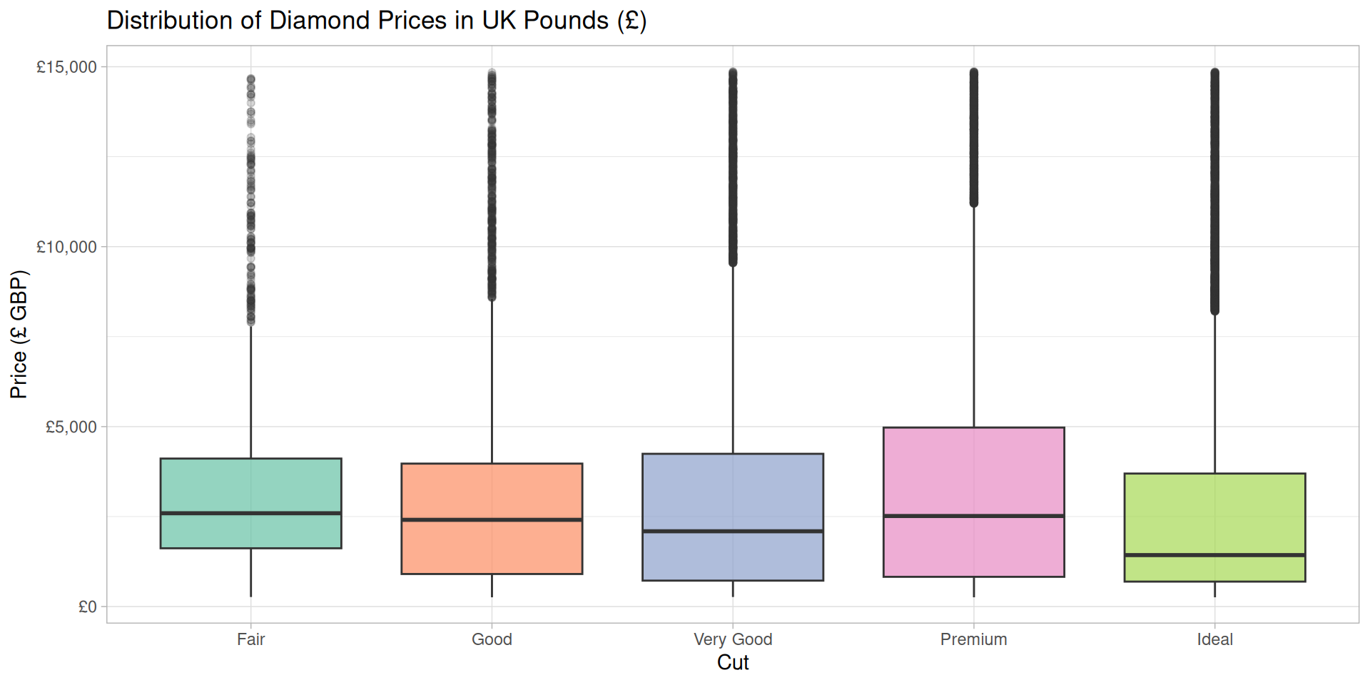
theme_minimal()# Boxplot of UK prices across different diamond cuts
diamonds %>%
mutate(price_gbp = price * 0.79) %>%
ggplot(aes(x = cut, y = price_gbp, fill = cut)) +
geom_boxplot(alpha = 0.7, outlier.alpha = 0.2) +
scale_y_continuous(labels = scales::dollar_format(prefix = "£")) +
scale_fill_brewer(palette = "Set2") +
labs(
title = "Distribution of Diamond Prices in UK Pounds (£)",
x = "Cut",
y = "Price (£ GBP)"
) +
theme_light() +
theme(legend.position = "none")library(tidyverse)
y <- c(1, 2, NA, 4, NA, 6)
which(is.na(y)) %>% print() # Print which elements are missing
Note
We can detect when values are missing using the is.na() function. This is crucial for data cleaning and analysis, as missing values can affect statistical calculations and visualizations.
Note
is.na() returns TRUE/FALSE for every cell. Wrapping it in sum() adds up the TRUEs (each TRUE counts as 1), giving the total count of missing values anywhere in grades.
student   quiz1   quiz2   quiz3
      0       2       1       1
Tip
colSums() applies sum() down each column of the logical matrix produced by is.na(). This tells us which columns need the most cleanup — here, quiz1 has the most missing values.
quiz1 has missing values!
[1] 2 5
Note
any(is.na(x)) returns a single TRUE/FALSE, so it’s perfect for an if statement. which(is.na(x)) tells you the exact positions of the missing values.
[1] 88.00000 86.33333 76.00000 95.00000 86.33333Important
x[is.na(x)] <- mean(x, na.rm = TRUE) finds the missing positions and overwrites only those with the column’s mean. This is called mean imputation — convenient, but it reduces variability and can bias results if too many values are missing.
na.omit() student quiz1 quiz2 quiz3
1 Ana 88 91 84
4 Dan 95 89 NAWarning
na.omit() drops any row containing at least one NA. It’s simple, but every dropped row throws away real data from the other columns too — that’s the trade-off with mean(x, na.rm = TRUE) and imputation approaches.
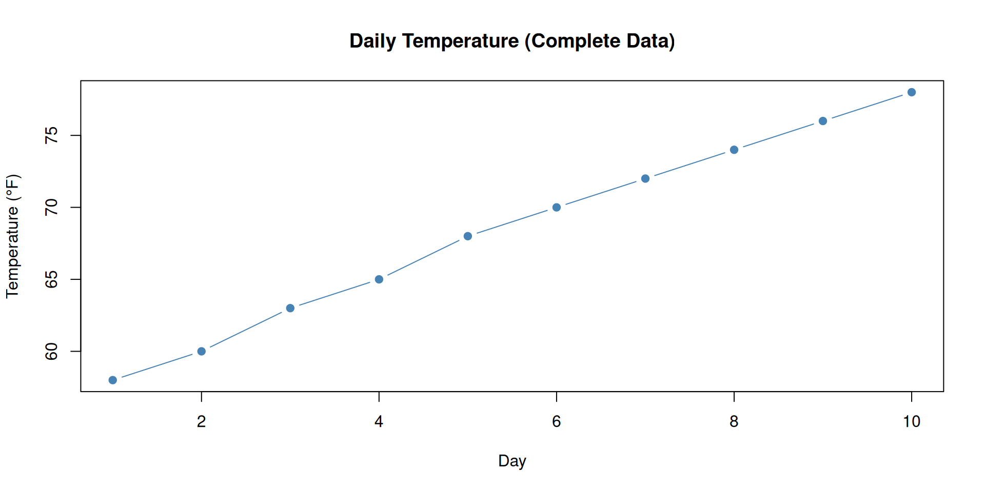
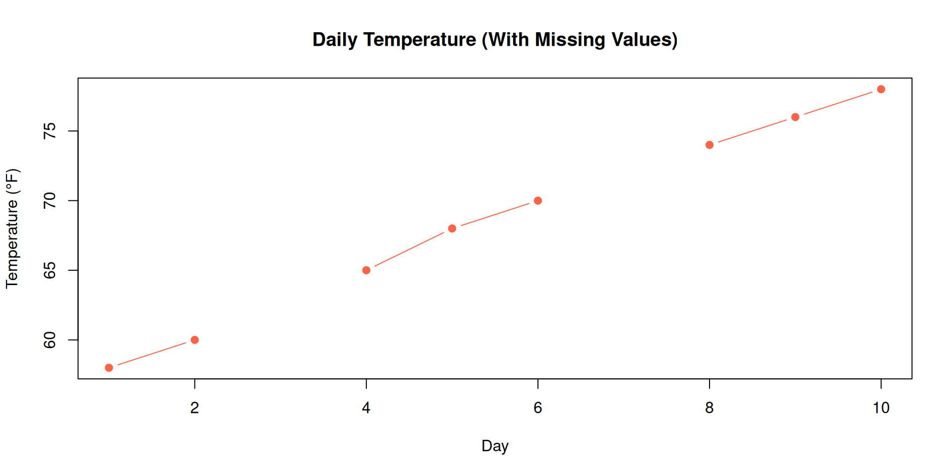
Let’s build a small time series and see what happens when a few values go missing.
Important
Notice the gaps in the line — plot() simply skips over NA values, breaking the trend and hiding what actually happened on those days.
[1] 68.4[1] NA[1] 68.625Important
A single NA can turn an entire mean(), sum(), or sd() into NA — with no error or warning. Always check is.na() / sum(is.na()) before trusting a summary statistic, and remember that na.rm = TRUE changes which data the calculation is based on.
x <- c(4, NA, 8, NA, 10). What does sum(is.na(x)) return?R ships with a real dataset that already contains missing values: airquality — daily air quality measurements in New York, May–September 1973.
airquality?colSums(is.na(airquality)), which column has the most missing values?airquality that has any missing value, save it as clean_air, and report how many rows remain.
clean_air <- na.omit(airquality)

nrow(clean_air)


# 111 rows remain (out of 153) — 42 rows had at least one NA
Important
Real Data is Messy!
Learn to handle NA (Not Available) values
# Checking for missing values
is.na(data$column)           # Logical vector
sum(is.na(data$column))      # Count NAs
any(is.na(data))             # Any NAs?
complete.cases(data)         # Rows with no NAs

# Remove rows with ANY NA
data_clean <- na.omit(data)
data_clean <- data[complete.cases(data), ]

# Remove rows with NA in specific column
data_clean <- data %>% filter(!is.na(column_name))

# Replace NA with value
data %>%
  mutate(column = replace_na(column, 0))

# Replace NA with mean
data %>%
mutate(column = ifelse(is.na(column), mean(column, na.rm=TRUE), column))library(stringr)
# Common string operations
data %>%
mutate(
upper_name = str_to_upper(name),
lower_name = str_to_lower(name),
name_length = str_length(name),
contains_a = str_detect(name, "a"),
replaced = str_replace(name, "old", "new"),
extracted = str_extract(name, "[A-Z]+")
)
# Pattern matching
data %>%
filter(str_detect(column, "pattern"))
# Combining strings
data %>%
mutate(full_name = str_c(first_name, last_name, sep = " "))# Analyze mtcars comprehensively
analysis <- mtcars %>%
# Add row names as a column
rownames_to_column("car_name") %>%
# Create new variables
mutate(
efficiency = case_when(
mpg > 25 ~ "High",
mpg > 20 ~ "Medium",
TRUE ~ "Low"
),
hp_per_cyl = hp / cyl,
weight_class = ifelse(wt > 3.5, "Heavy", "Light")
) %>%
# Filter to powerful cars
filter(hp > 100) %>%
# Select relevant columns
select(car_name, mpg, hp, hp_per_cyl, efficiency, weight_class) %>%
# Sort by horsepower
arrange(desc(hp))
# Group analysis
summary_by_efficiency <- mtcars %>%
mutate(
efficiency = case_when(
mpg > 25 ~ "High",
mpg > 20 ~ "Medium",
TRUE ~ "Low"
)
) %>%
group_by(efficiency) %>%
summarize(
count = n(),
avg_hp = mean(hp),
avg_mpg = mean(mpg),
avg_weight = mean(wt)
)| Task | Function | Example |
|---|---|---|
| Select columns | select() |
select(data, col1, col2) |
| Filter rows | filter() |
filter(data, age > 18) |
| Create columns | mutate() |
mutate(data, new = old * 2) |
| Sort | arrange() |
arrange(data, desc(col)) |
| Task | Function | Example |
|---|---|---|
| Group | group_by() |
group_by(data, category) |
| Aggregate | summarize() |
summarize(data, avg = mean(x)) |
| Count | count() |
count(data, category) |
| Rename | rename() |
rename(data, new_name = old_name) |
group_by(category), what does summarize(avg = mean(price)) return?
library(dplyr)


mtcars |>

  filter(hp > 100) |>

  group_by(cyl) |>

  summarize(avg_mpg = mean(mpg))


# Key: filter() → group_by() → summarize()
What We Learned Today
✅ Tidyverse ecosystem
✅ Pipe operator %>% for readable code
✅ Six core dplyr verbs
✅ Data cleaning techniques
✅ Interactive dplyr pipeline builder
For Next Class: Data Visualization (Base R & ggplot2)
📚 Practice: Build dplyr pipelines with mtcars, iris, diamonds
💻 Experiment: Combine verbs in creative ways
🔮 Preview: We’ll start visualizing data with plots!